2025
Mbowa Trading Project
A visual identity for a worthy cause
Sector
CharityWhat we did
Visual Identity, Brand Strategy, Logo Design
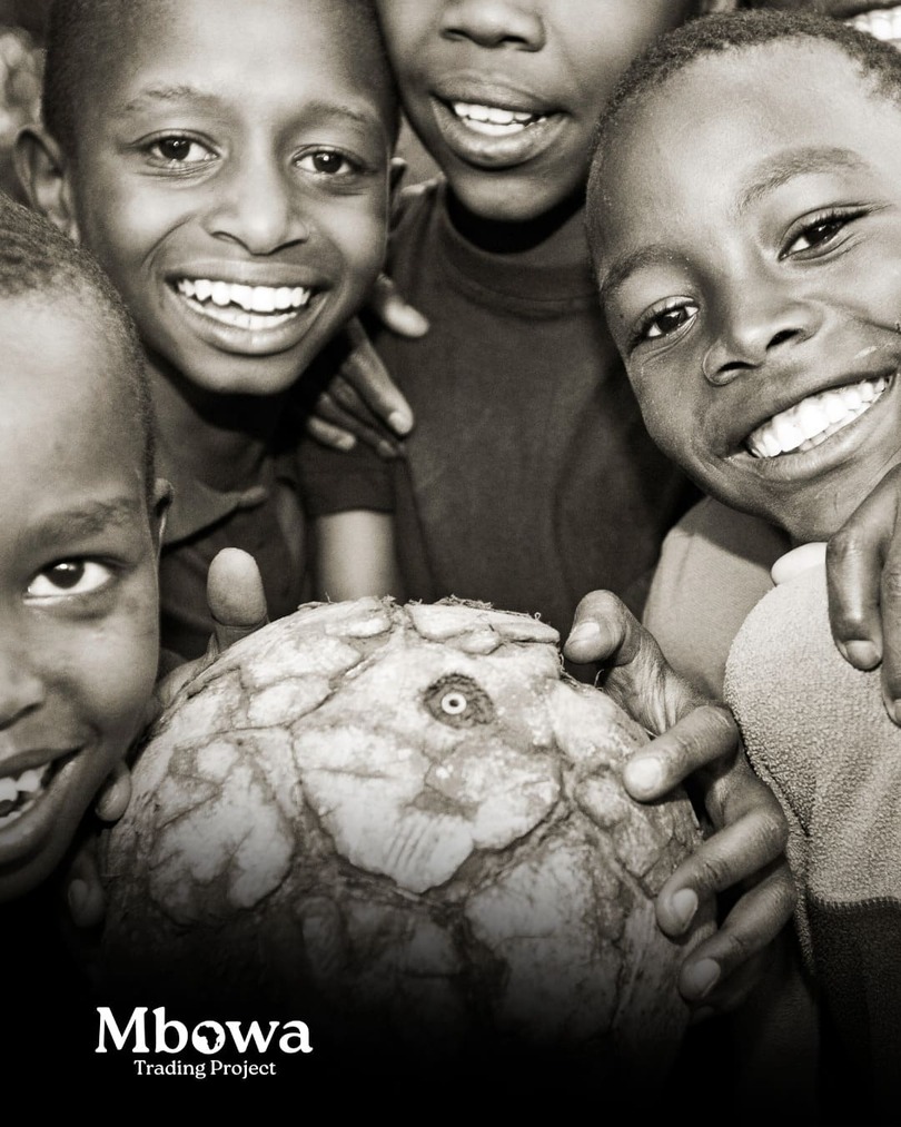
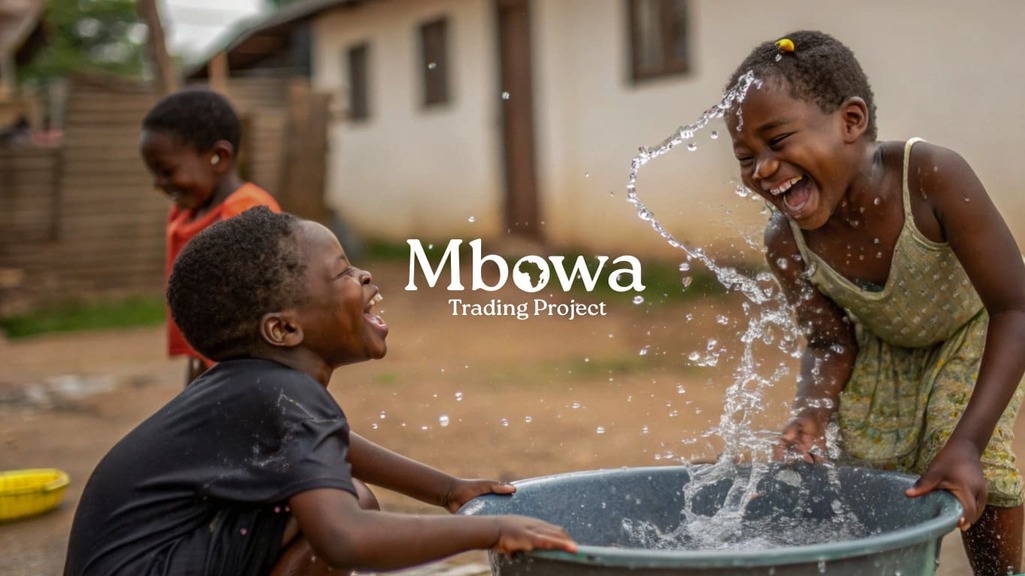
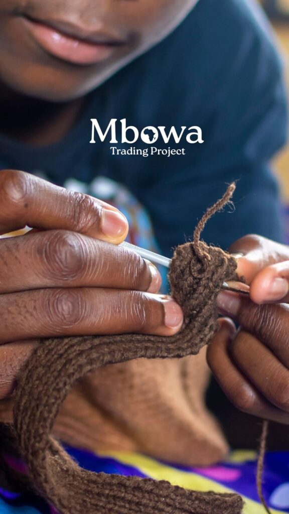
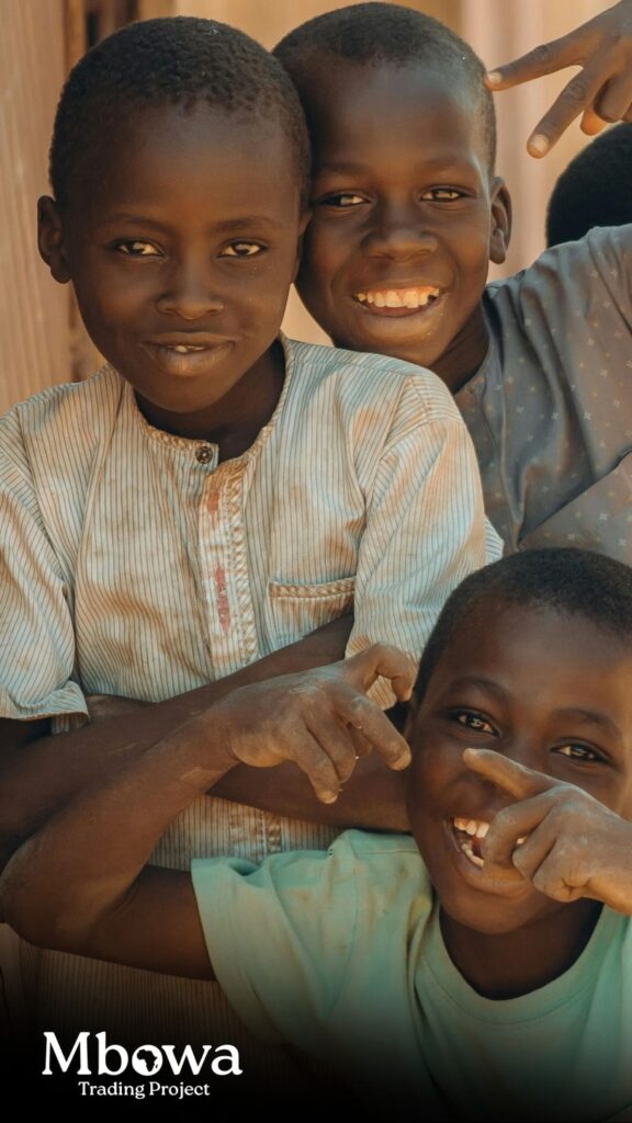
Mbowa Trading creates beautifully handcrafted goods rooted in African craft, care, and intention. Our role was to help that story travel, to be seen, felt, and trusted in the UK
Through a new visual identity, we translated Mbowa Trading’s values into a clear and confident brand system. The identity draws from African craft and texture, balancing warmth with credibility to ensure the brand feels both authentic and trusted in the UK market. From logo refinement and colour to typography and visual language, every element was designed to honour the makers behind the goods while elevating how the brand is perceived internationally. The result is an identity that not only looks beautiful, but supports Mbowa Trading’s wider socio-economic mission by giving their work the presence, authority, and recognition it deserves.
Measuring Success
Buildng a brand identity that provides the recognition this initiative deserves.
Brand touchpoints defined
12
Brand consistency ratio across public-facing materials
100%
Increase in aided brand recall and recognition from new brandmark
74%
Realising the brief
Mbowa Trading needed a visual identity that could carry their handcrafted goods from Africa into the UK market with confidence. The brief was to create a brand that felt authentic to its roots while building trust, credibility, and recognition with a new audience. It needed to honour the makers and the socio-economic mission behind the brand, without feeling informal or underdeveloped.
We approached the identity with care, listening first, then translating Mbowa Trading’s values into a visual language that feels warm, confident, and considered. Drawing inspiration from African craft, texture, and community, we created an identity that balances human feeling with authority. Every decision was made to support clarity, consistency, and trust, ensuring the brand could grow, scale, and be recognised in the UK while staying true to where it comes from.
Established a core brandmark
Defined a consistent visual identity
Created a clear and useable brand guidelines
Developed a branding that embodied their mission
Improve brand recognition and recall
Working with Everclick has been amazing. They truly understand what we do and why it matters, and they helped us share our story in a way that feels real, honest, and full of heart. The team is kind, friendly, and genuinely cares about the people and communities we support.
Because of Everclick, more people are hearing about our work, connecting with our cause, and joining us to make a difference. They have a way of making you feel supported and inspired at the same time, and we couldn’t be more grateful for everything they’ve done.
Gem West
Co-Founder
Translating Mission into Visual Identity
Working with Mbowa Trading Project was an inspiring journey. Their mission to help African artisans and small businesses bring their handcrafted goods to the UK and earn fair profits carries so much weight and purpose. Our challenge was to translate that mission into something visual that feels authentic, uplifting and instantly recognisable without ever feeling forced or clinical.
We wanted the brand to tell the story of the people behind it, the culture, and the connection between Africa and international markets. Every choice, from the typeface to the colours, was made with intention. The goal was not just to create something visually appealing, but to craft an identity that genuinely reflects Mbowa’s values of empowerment, creativity and pride in African craftsmanship. By grounding the visual identity in cultural references while keeping it accessible for global audiences, we were able to create a brand that feels alive, human and full of purpose.
Our approach
We approached Mbowa’s identity with care, making sure every detail reinforced the story they wanted to tell. Here is how we broke it down
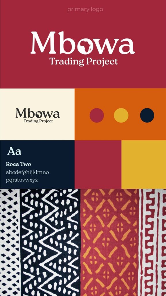
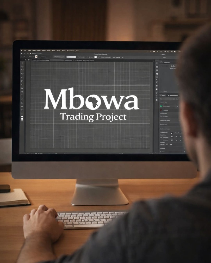
Crafting a Logo with Meaning
The “O” in Mbowa carries the subtle outline of the African continent, a simple and powerful nod to the brand’s roots. The curved Roca Two typography feels natural and approachable, reflecting the handmade, human side of the project. It is modern enough for an international audience while remaining warm, inviting, and grounded in culture.
Choosing a Colour Palette That Speaks
Colours are more than decoration, they carry feeling. Deep orange and red evoke energy and passion, while dark blue communicates trust and stability. Gold highlights symbolise value, quality and aspiration. Together the palette connects Africa’s vibrancy with the premium, international nature of the market Mbowa operates in.
Building a Consistent, Flexible Visual Language
Beyond the logo and colours, we created visual elements that can travel across packaging, online platforms and print. Curves, rich tones and subtle cultural references give the brand a cohesive, human feel. Every element reflects the care, creativity and empowerment at the heart of Mbowa’s work.